Down with bar graphs

Standard

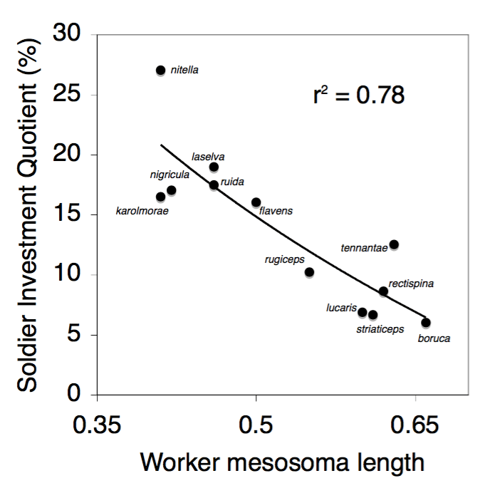
Some folks really hate pie charts, but I think for some purposes, they can communicate precisely the information we want them to. But, on the other hand, who’s our real enemy? Bar graphs.

Introducing Exhibit A (which is Figure 1 from Weissgerber et al.):

journal.pbio.1002128.g001.PNG

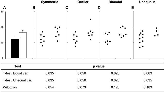
Bar graphs tell us the mean, and some kind of measure of variance (standard deviation? standard error? confidence interval?). And that’s it. Continue reading

Starting experiments with a “nut fig”

Standard

The term “backwards design” is often applied to curriculum design. If you want your students to learn a particular thing, you start with identifying what that outcome should look like at the end of the semester. Then you design your class backwards from that outcome, to make sure your students have a way to get there.

I think we should be talking more about backwards design when when it comes to statistics and the design of experimental and observational research.

Journalists call the key passage of each story a “nut graf.” Shouldn’t we have a “nut fig” for each experiment, and know what the axes and statistical tests will be before we run an experiment? Continue reading