
Some folks really hate pie charts, but I think for some purposes, they can communicate precisely the information we want them to. But, on the other hand, who’s our real enemy? Bar graphs.
Introducing Exhibit A (which is Figure 1 from Weissgerber et al.):
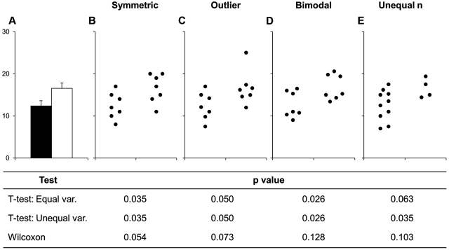
Bar graphs tell us the mean, and some kind of measure of variance (standard deviation? standard error? confidence interval?). And that’s it. That’s leaving out a lot information that could be really important for interpreting the difference between two sample populations.
A great blog post laying out three kinds of plots that improve on bar graphs was written last year by Dr. Aud Halbritter. The alternatives are box plots, violin plots, and sina plots.
If you were to browse through the papers I’ve published over the years, you would notice a lot of bar graphs. A lot. Why did I do this? Well, I didn’t know better, and the software that I was using to create these figures didn’t readily facilitate other approaches. Now that so many people are making figures in R with ggplot, then there really is no excuse for these folks to avoid bar graphs. Now, when I see a bar graph, I wonder what’s being hidden from me.
Why do bar graphs remain popular? Well, historical momentum, I suppose. And also, if your evaluation is based on a parametric test that only utilized mean and variance, then perhaps a bar chart is telling you everything that the statistical test sees. Which might be a symptom of a much bigger problem, eh?
Some other handy blog posts and papers on the topics are here, and here.
If we want to see quick movement on this front, then reviewers and editors can make a point of raising this during the review process. Better yet, editorial boards can improve instructions to authors to include suggestions about approaches to experimental design and data visualization, including a caution against bar graphs. Which is what’s prompted this blog post, I’ve found myself over the past month having a lot to say in the review process about bar graphs. So I thought I’d share this more widely.

These are excellent reasons to use different plots during exploration of the data. If the data are normally distributed, bar graphs might be fine. More complex plots may not be worth it for some situations (e.g., presentations), because they take longer to interpret.
Coincidentally, I reviewed a ms which was using it and, looking for papers justifying to not use bar chart, I read the term “dynamite plot” :D
These are all important points, but it’s not always feasible or possible to show everything about the data. Zen’s comment above pointed out one situation where it may be more practical for communication purposes to use the simplest possible graph; in addition, there are some types of data where it’s actually impossible to visualize every data point and the relevant connections between them. Shameless plug for a paper my colleague and I wrote on this issue: https://www.sciencedirect.com/science/article/pii/S0095447017301407
I like R ggplot geom_boxplot( varwidth = TRUE) , using the option to make the width of the box indicate sample size